How to Calculate Churn Rate and Stop Losing Customers
Learn how to calculate churn rate for your app with clear formulas and practical examples. Master customer and revenue churn to improve retention.
To calculate your basic churn rate, you just divide the number of customers you lost in a certain period by the number you started with. Multiply that by 100, and you have your percentage. It's a simple formula that gives you a quick snapshot of how many people are walking away.
This is the first, most crucial step toward keeping more of your hard-won users.
Why Churn Is Your App's Critical Health Metric
Before we get bogged down in formulas, let's talk about why this matters so much for your app's survival. Your churn rate isn't just another number to track on a dashboard; it is a direct reflection of your product-market fit, how happy your users are, and whether your business has a stable future. It tells you, in no uncertain terms, if your app is actually delivering what it promises.
A high churn rate will quietly kill your growth. You can have the most brilliant user acquisition campaigns in the world, but they mean nothing if new customers are leaving just as fast as they come in.
It's like trying to fill a bucket with a hole in it. You keep pouring more water (and marketing dollars) in, but the level never rises. This is exactly why any solid mobile app marketing strategy has to be obsessed with retention from day one.

Key Churn Metrics at a Glance
Getting a handle on churn means understanding that there's more than one way to measure it. Each type of churn tells a different part of your app's story. Think of them as different diagnostic tools for figuring out what's really going on with your user base.
Here is a quick rundown of the main metrics we'll be breaking down.
Knowing these distinctions is the first step toward making churn a powerful business tool, not just a scary number.
This guide isn’t just about the math. We're going to treat churn calculation as what it truly is: an essential skill that helps you make smarter decisions, hold onto more users, and build a business that lasts.
Calculating Customer Churn with a Simple Formula
If you're just getting started with churn, the best place to begin is by looking at your customers. This is what we call customer churn rate, and it's a straightforward metric that tells you what percentage of your users ditched your app during a specific timeframe.
Think of it as the go-to health check for your app's retention. The beauty of this calculation is its simplicity; it cuts through the noise and gives you a clear signal.
The formula looks like this:
((Users at Start - Users at End) / Users at Start) * 100
When you run this calculation, you get a simple percentage. For instance, a 5% churn rate means that for every 100 customers you had at the beginning of the month, you lost five by the end of it.

Putting the Formula into Practice
Let's walk through a quick, practical example. Imagine you run a B2C fitness app called "FitPulse" and you want to figure out your churn for April.
First, you'll need two key pieces of data, which you can usually pull from your app's analytics or user database.
- Users at the Start of April: You kicked off the month with 10,000 active users.
- Users at the End of April: By the last day of the month, that number had dropped to 9,200 active users.
With those two numbers, we can plug them right into the formula. Here is the breakdown:
- First, figure out how many users you lost:
10,000 - 9,200 = 800 lost users. - Next, divide the lost users by your starting number:
800 / 10,000 = 0.08. - Finally, turn that decimal into a percentage:
0.08 * 100 = 8%.
So, for the month of April, FitPulse had a customer churn rate of 8%. Now you have a concrete number you can use as a benchmark to see if you’re improving in May and June.
Key Takeaway: This basic churn calculation intentionally ignores any new users you acquired during the month. It's designed to measure one thing and one thing only: how well you held onto the customers you already had. This is a pure test of your product's stickiness.
A Spreadsheet-Ready Formula
You'll want to track this regularly, and the easiest way is in a simple spreadsheet. Setting this up in Google Sheets or Excel saves you from doing manual math every month.
Let's say your data is organized like this:
- Cell A2:
Users at Start of Period - Cell B2:
Users at End of Period
In any empty cell, just paste this formula:
=((A2-B2)/A2)
All you have to do next is format that cell to display as a percentage. Just like that, you have a dashboard that gives you an at-a-glance view of your retention performance, turning raw data into a consistent insight you can actually act on.
Don't Just Count Users, Count the Dollars: Calculating Revenue Churn
Tracking how many users you lose is a start, but it's a vanity metric if you don't know the financial impact. Let’s be real: losing a small-time user on your basic plan hurts a lot less than losing a high-value enterprise client.
This is exactly why you need to be calculating revenue churn. It shifts the focus from simple headcounts to the actual dollars walking out the door.
For any subscription app, Monthly Recurring Revenue (MRR) is your lifeblood. So, looking at MRR churn gives you a much more honest and sometimes sobering picture of your company's health. It answers the most important question: how much predictable income did you actually lose this month?
If you only look at user numbers, you can easily miss a huge problem, like a quiet exodus of your most profitable accounts.
Gross vs. Net Revenue Churn: What's the Difference?
To really understand what's happening with your revenue, you need to look at it from two angles: Gross MRR Churn and Net MRR Churn. Each one tells a different part of the story.
- Gross MRR Churn is the raw, unfiltered loss. It's the total monthly recurring revenue you lost from customers who either canceled their subscriptions or downgraded to a cheaper plan. Think of it as the total financial damage, with no silver linings.
- Net MRR Churn is a more nuanced metric. It starts with the revenue you lost from churn but then subtracts any new revenue you gained from your existing customers. This "new" money is called expansion MRR, and it comes from users upgrading their plans or adding new services.
Why track both? Gross churn tells you how much revenue you're bleeding from cancellations, period. Net churn, on the other hand, shows whether you're successfully growing your existing customer base enough to make up for those losses. It is a great way to measure how well your upselling and expansion efforts are working.
A Real-World SaaS Example
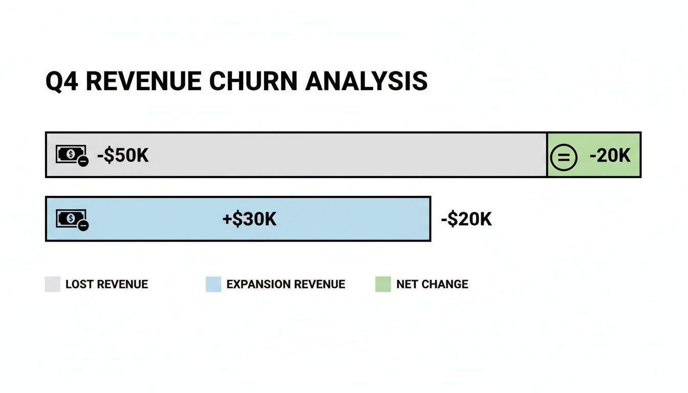
Let's put this into practice. Imagine you run a B2B project management app called "TaskFlow," and you want to figure out your revenue churn for May.
Here are your numbers for the month:
- MRR at the Start of May: $50,000
- MRR Lost from Churned Customers: $4,000 (a few small teams and one mid-sized company left)
- Expansion MRR from Existing Customers: $2,500 (several teams upgraded to a premium tier)
First, we'll calculate the Gross MRR Churn Rate:
(MRR Lost / Starting MRR) * 100
($4,000 / $50,000) * 100 = 8%
TaskFlow’s Gross MRR Churn is 8%. That is the total revenue hit from customers who bailed. Now, let's figure out the Net MRR Churn Rate:
((MRR Lost - Expansion MRR) / Starting MRR) * 100
(($4,000 - $2,500) / $50,000) * 100 = 3%
The Net MRR Churn is just 3%. See the difference? Even though TaskFlow lost $4,000 in revenue, it made back a good chunk of that from happy, existing customers who upgraded. That paints a much healthier picture of the business.
Pro Tip: The holy grail for SaaS is negative net churn. This happens when your expansion MRR is actually greater than your lost MRR. It is a powerful growth engine because it means your existing customer base is generating more new revenue than you're losing from cancellations.
These churn calculations are tightly linked with what you spend to get customers in the first place. You can see how these acquisition expenses stack up against long-term value by using a customer acquisition cost calculator.
Using Cohort Analysis to See When and Why Users Leave
A single, overall churn rate gives you a number, but it doesn't tell you the story behind it. It lumps all your users together, including the loyal veterans who've been with you for years and the brand-new signups from yesterday. This average can be really misleading.
To get a much clearer picture of retention, you need to look at specific groups of users, or cohorts.
Cohort analysis is just a way of calculating churn by grouping users who share a common trait. The most common way to do this is by their sign-up date. So, everyone who joined your app in January becomes the "January Cohort," everyone from February is the "February Cohort," and so on.
When you track each cohort separately over time, you start to see patterns that a blended, single churn rate would completely hide.
Reading the Story in Your Data
Let's say you rolled out a major new onboarding tutorial at the beginning of March. With cohort analysis, you can compare the retention of the March Cohort directly against the February Cohort.
If you notice that users from March are sticking around 30% longer in their first month than the folks from February, you have solid proof that your new tutorial is making a difference. You simply can't get that kind of insight from a single churn number. It is how you connect the dots between your actions and user behavior.
By isolating variables, cohort analysis lets you see the direct impact of product updates, marketing campaigns, or even pricing changes on user retention. It turns your churn data from a simple grade into a detailed report card.
This kind of visualization drives home how new revenue from existing customers can offset losses, highlighting why net revenue churn is such a critical health metric for any subscription business.
Identifying Critical Drop-Off Points
One of the biggest wins from cohort analysis is pinpointing exactly when users are bailing. The mobile app industry is brutal. It's not uncommon for less than 5% of users to remain active after just one month.
In fact, some data shows that Day 1 churn rates can soar above 80% as people quickly abandon apps that don't immediately click with them. You also see big jumps in churn at Day 7 and Day 30, which shows just how fast you can lose an audience. For a deeper dive into these numbers, you can explore some detailed mobile app statistics.
By analyzing your cohorts, you'll likely spot a few common patterns:
- High Early Churn: If a huge chunk of a cohort disappears within the first few days, that's a massive red flag. It almost always points to a confusing onboarding process or a failure to show off your app's real value upfront.
- A Steep Drop-off at 30 Days: Does your churn rate spike right around the 30-day mark? This could be tied to the end of a free trial, signaling that users weren't convinced enough to pull out their credit cards.
- Gradual Decline: A slow, steady bleed of users over time might suggest a different problem. This could be a lack of new features, poor ongoing engagement, or just a really strong competitor luring people away.
With this kind of knowledge, you can stop guessing and start taking targeted action. You can intervene at the precise moment users are most at risk. Maybe that means sending a helpful tip on Day 3 or offering a discount right before their trial is set to expire.
Alright, you've got your churn numbers. Now what?
Those calculations aren't just for a dashboard; they're a direct line to your users. They're showing you, in stark black and white, what's working and what's sending people heading for the exit. The real work begins now, turning those numbers into actions that actually grow your app.
Let's be clear: there's no magic bullet for churn. It's about a series of smart, targeted moves that improve the user experience right when it matters most. The goal is simple: show your value, show it fast, and become a can't-live-without-it part of your user's day.
Nail Your User Onboarding Experience
Seeing a huge drop-off in the first few days? That is almost always an onboarding problem. New users have zero patience. They need to feel the value of your app immediately. If that first interaction is confusing, overwhelming, or just plain boring, they're gone. And they're probably not coming back.
You have to create a super-smooth path to that "aha!" moment.
- Simplify Your Signup: Every single field you ask for is a potential reason for someone to give up. Cut everything that isn't absolutely essential.
- Create an Interactive Walkthrough: Ditch the passive slideshow tour. Guide users to complete one key action that delivers immediate value. If you're a fitness app, help them log their very first workout.
- Personalize from the Get-Go: Ask new users what they want to achieve. Then, use that info to customize their first screen, showing them the features that will help them reach their goals right away.
Think of onboarding as your first and best line of defense against churn. It sets the stage for everything that follows.
Get Proactive with Customer Engagement
Don't just sit back and wait for users to get stuck or drift away. Reaching out proactively shows you're invested in their success, and that feeling of being valued is a powerful way to build loyalty.
A great place to start is by identifying users who are showing early warning signs of disengagement. Maybe they haven't logged in for a week. That's your cue to hit them with a targeted email or a friendly in-app nudge to bring them back into the fold.
Here's the bottom line: A user who feels heard and supported is much less likely to leave. Small, proactive gestures can stop minor frustrations from becoming deal-breakers.
When you build a system that anticipates what your users need, you can solve problems before they even happen. For a much deeper dive on this, check out our full guide on powerful mobile app retention strategies.
Let User Feedback Drive Your Roadmap
Your churn data tells you that users are leaving. Your user feedback tells you why. You absolutely need to create easy, obvious ways for people to share their thoughts. This could be anything from simple in-app surveys and feedback forums to a quick follow-up email when someone cancels their subscription.
When you look at this feedback alongside your cohort analysis, you'll start seeing some powerful patterns. You might discover that a specific feature is a constant source of frustration, or that users are jumping ship to a competitor who offers something you don't.
This is especially critical for subscription apps, where every lost user is lost revenue. The market is shifting; about 35% of apps now mix subscriptions with other purchases to combat churn. This trend is led by Gaming (61.7%) and Social & Lifestyle (39.4%) apps. Interestingly, monthly subscribers have the highest reactivation rates, often over 13%, which proves that even a churned user isn't necessarily gone for good. You can read more about these subscription app trends.
By consistently collecting, analyzing, and acting on this feedback, you build an app that grows with your users. That is how you become indispensable.
Common Questions About Calculating Churn
Even with the formulas in hand, a few practical questions always pop up when you start digging into your own app's churn rate. Getting the details right here is crucial. It's the difference between a vanity metric and a number you can actually use to make smart decisions.
Let's clear up a few of the most common sticking points.
What Time Frame Should I Use?
People often wonder whether they should be looking at churn weekly, monthly, or quarterly. For most apps, monthly is the sweet spot.
It is frequent enough that you can catch worrying trends before they get out of hand, but it is also long enough to smooth out the random noise of daily or weekly fluctuations. Looking at it weekly can make you jump at shadows, while a quarterly view is often too slow for a fast-moving app business.
What Is a Good Churn Rate?
This is the million-dollar question, and the honest answer is: it depends. Benchmarks are all over the place. A consumer app might be okay with a 5-7% monthly churn, but if you're a B2B SaaS tool, you should be aiming for something much lower, ideally under 2%.
The most important benchmark, though, isn't some industry average. It's your own historical data.
A "good" churn rate is one that's consistently trending downward because of the work you're putting into retention. Your goal should always be to beat last month's number.
A high churn rate is a serious red flag. According to a 2023 report from Zendesk, 73% of consumers will jump to a competitor after having multiple bad experiences. It's a stark reminder of how closely customer service and retention are linked.
Is 0% Churn Even Possible?
In a word? No. Chasing a 0% churn rate is a recipe for frustration. Some churn is just a natural part of doing business. Customers' needs change, companies go out of business, and projects end. It happens.
Instead of obsessing over zero, a much healthier and more powerful goal is to achieve negative net revenue churn.
This is the holy grail for subscription apps. It means the new revenue you're generating from existing customers (through upgrades, add-ons, etc.) is greater than the revenue you're losing from the customers who cancel. When you hit that point, your business can grow even without adding a single new customer. That's the real sign of a healthy, sustainable model.
Ready to turn your churn insights into a powerful growth engine? Adworkly combines expert strategy with AI-driven execution to build scalable user acquisition and retention systems for mobile apps. Let us help you get your growth on autopilot. Learn more at adworkly.co.